Revamping Shop’s onboarding experience for order-tracking users with content research

I led a qualitative research project that resulted in the creation of a new-and-improved user onboarding flow for people downloading the Shop app to track their orders. The new experience used clarifying language and a more strategic order of operations to help users accomplish critical tasks people were skipping in the old flow.
The problem
As Shop began transitioning from a sole tracking-app utility to a shopping experience, its onboarding flow underwent a series of optimizations that tried to upsell users on the idea of shopping. However, the bulk of the app’s new users were downloading it for the sole purpose of tracking their orders. The team experimented with adding shopping content at key points in the onboarding flow, but those tests repeatedly failed. We tried placing shopping value props front and center at the expense of tracking, which repulsed users who wanted to primarily use the app for tracking. The disconnect prompted users to drop out of the flow prematurely and fail to complete critical tasks that would set them up for success.
The proposal
In late spring, Shop’s leadership identified a new onboarding experience as one of the organization’s most critical, can’t-fail missions for the rest of the year. At the same time, I pushed for the team to deploy more content-specific tests: we were shipping a lot of content, but didn’t have enough data showing whether it was effective at accomplishing our goals. I rallied my content design peers together, and the three of us identified a series of projects that we wanted to test. Onboarding was at the top of the list. I consulted with our UX leadership and partners on the Growth team and determined that content would be a major part of improving the onboarding experience. I took lead and sought to find a way to use research and content testing to inform the next phase of Shop’s new-user onboarding journey. I determined that we should create a new onboarding prototype and validate/invalidate it with users. And so began our onboarding research project.
The process
I created a detailed research brief that listed objectives for our prototype research, including the assumptions and hypotheses we wanted to test, as well as the deliverables we expected and the fidelity of feedback we needed. I drafted a rubric for what we hoped to learn from the research project and solicited feedback from key stakeholders, including Shop’s staff UX researcher and the Growth team’s UX manager and lead product manager. Once the brief got the appropriate amount of stakeholder buy-in and sign-off, I worked with Growth’s UX manager to combine the strategy outlined in my research brief with a long-term onboarding strategy he independently worked on and distill it all into an actionable research plan.
From there, we formed a small tiger team of people who would be critical to ensuring the work got done. I led the research portion of the project while the UX manager would led the beginnings of the prototype.
Creating the prototype
I partnered with the product designer and content designer embedded on the Growth team to develop a new prototype to test with our research respondents. Thanks to the challenge of working in different time zones (the product designer lives in Belgium and the content designer in Barcelona), the three of us had a small amount of time to jam on the project together. Fortunately, we used a system of videos and audio recordings over Slack to keep each other asynchronously abreast of our progress and ideas. As part of designing new content for the prototype, I took into consideration the actions we needed users to take, including giving the app permission to check for order information on their phones; turning on push and in-app notifications; and connecting their email address, from where the app would get order details. Other factors we considered while designing the content included:
The old onboarding flow prioritized shopping behavior and deprecated tracking even though users downloaded the app to track.
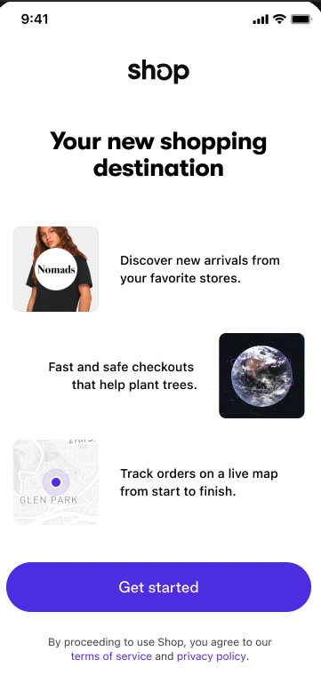
Keeping shopping content minimal, but not ignoring it completely. In past experiments, we either went overdrive on shopping content and shoehorned it where it didn’t belong or got rid of it completely. Neither was effective at properly setting user expectations: they’d come to track in the app, but also get exposed to shopping content that seemingly came from nowhere. For the prototype, we added shopping value props to splash screens at the beginning of the experience and then again near the end to create a bookend of sorts. That would better help users understand that shopping was part of the in-app experience, even though it’s not what they came to do.
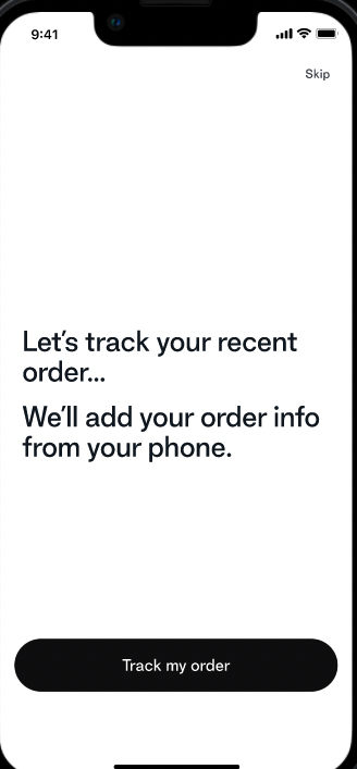
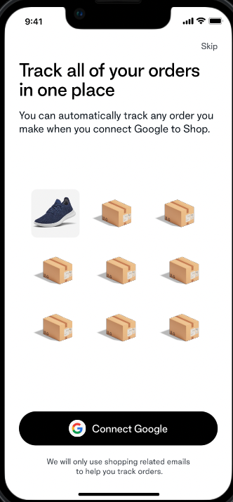
Fulfilling our users’ needs by focusing on tracking and utility. These users were coming to Shop to track their packages, so we decided that we needed to keep that thread cohesive throughout the onboarding flow. We used language like “Track your order every step of the way” and “Track your orders all in one place” at different points in the flow to offer mental affirmation and certainty that users should expect to track their packages once fully set up in the app. We also swapped the hierarchy of messaging to ensure that tracking was the star of the show, not shopping.
We got rid of unnecessary steps. In the old flow, users had to leave the app and go to their email to confirm we had the right address. We investigated a better solution with our engineering partners, and used the new iOS 16 paste feature to add order information from a user’s phone into the app. Of course, we didn’t want to use such technical jargon to explain this process, so my content design partner and I worked together to develop clearer, friendlier language that didn’t bog people down with minutiae.
Leading the research
Once I helped put the finishing touches on the prototype, I pivoted and took the reins of the research project. I drove it from start to finish, which means I:
Created and deployed a research plan in our research tool
Developed the criteria we used to recruit respondents
Booked respondents for interviews over the span of a week
Designed the discussion guide the team used to facilitate the conversation with respondents
Delegated moderator and notetaker responsibilities among the team
Moderated most of the interviews
Ensured respondents were paid for their participation
Acted as the custodian of our recordings and documentation for analysis
Turning insights to action
We immediately went to work aggregating the insights we got from respondents and pouring them into a MVP for a new onboarding experience. Respondents told us:
The tracking narrative was effective. They liked the idea of a “one-stop shop” for tracking their packages and taking care of the administrative aspects of shopping in one place.
New users were concerned about privacy and data, but microcopy and borrowed trust from Google and Outlook connection screens mitigate worry.
Some language in the experience (“supercharge your online shopping” and “special offers”) felt vague.
Messages like “Follow your order every step of the way” are powerful, but may be overkill for some.
Shopping wasn’t the primary focus, but understood that it was available in the app. Respondents told us they’d be interested in getting the app to try the shopping features.
I scheduled a debrief and, together, the team created an affinity map to analyze the results of our interviews. From there, we distilled these insights into a plan of action and executed against that plan for our MVP. I acted as a stakeholder for the duration of the project, working with the Growth team to finesse the messaging and design of the experience as we presented it to our senior leadership during a few feedback cycles. Finally, we settled on a clear direction and shipped the new experience.
The outcome + impact
We continue to track early results from the new onboarding flow, but so far we’ve collected quite a few learnings. More users are turning on push notifications — an indicator that demonstrating the value of the app before asking people to agree to alerts is proving effective. As of this writing, we’re still interpreting results and haven’t done a full analysis of our KPIs. That’s coming soon!