Improving transparency about eligibility requirement on the Shop app
I designed and revised information architecture for Shop merchants struggling to understand eligibility requirements for selling their products on the app. The improved UX, buttressed by clear content and an empathetic, user-focused strategy, drastically reduced support tickets and alleviated costly merchant friction and frustration.

The problem
Shopify merchants who want to sell their products on the Shop app must meet certain eligibility requirements to appear on the platform. In early 2022, a number of merchants learned they were no longer approved to sell. These merchants received a message in their Shop channel, a dashboard where they manage their app settings, telling them they were either “approved” or “not approved” to sell on Shop. The message didn’t provide any further clarification. Merchants barred from selling couldn’t understand why they were ineligible, and we didn’t offer any solutions to help them rectify the situation. Frustrated and confused merchants contacted Shop’s Support team, resulting in nearly 2,000 support tickets that cost nearly $71,000 to resolve.
The proposal
So many comments. I raised several questions about the language we used and interfaced with folks in Engineering, Support, and Legal to find answers and gain context.
We needed to give merchants more information about why they were no longer eligible for selling products on Shop, as well provide a remedy to their eligibility status without contacting Support.
The product team devised a solution: create a checklist that surfaced the same information and language the Support team used to diagnose the reasons for the merchant’s ineligibility during support calls. The product designer began initial explorations in this direction, which she soon realized was shortsighted and could potentially add more friction and cognitive load to the merchant experience. Fortunately, another content designer and I got involved early enough to influence and improve the outcome.
The process
To start, I audited the existing content the Support team used when communicating with merchants. I interrogated the language, quickly realizing it was overly-technical and complex. I fielded questions to Engineering, Support, and Legal teams, so I could understand exactly what the words meant in the context of merchant eligibility. Once I understood the messages we wanted to communicate, I began translating the words into plain language (I like to call it “human-speak”), so the checklist was as clear as possible. At this point, my content design peer jumped in and together we developed a new body of eligibility language that we felt was clear, concise, and actionable. I dug into our support documentation and added in-line text links to those help docs to help merchants find fixes to their eligibility problems. That was the first pass; I wasn’t close to being done.
Newly-discovered problems
As I started auditing content, I realized the checklist presented deeper UX challenges:

Yikes!
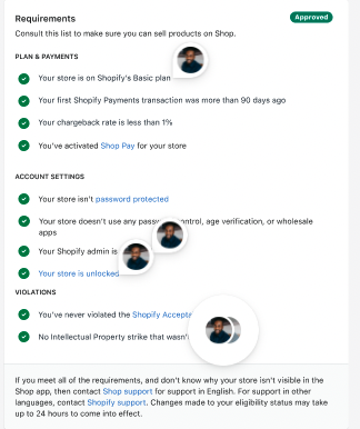
Merchants who did meet the eligibility requirements would see a long list of approvals reinforced by deep green checkmarks. If they were fully approved, though, they didn’t need to see a list that would only clutter their Shop channel.
Conversely, merchants who didn’t meet any eligibility requirements would see a long list of disapprovals marked by red Xs. I felt like we’d wind up serving our users an awful experience mired in negativity, shame, and finger-wagging.
Merchants who met some requirements but not others would get exposure to a mix of green and red design patterns smushed together. I was confident that would add to their confusion.
In the channel, engineers labeled the eligibility checklist “Requirements” with nary a mention of eligibility. “Requirements” as a standalone title was misleading and vague given the checklist centered on a merchant’s eligibility status.
This entire experience unfolded beneath a section in the Shop channel labeled “Shopping.” Yet, everything about this checklist focused on merchants selling products. “Shopping” felt like the wrong label.
Newly-developed solutions
Unwilling to ship bad UX to our merchants, I iterated on a new solution to the myriad of problems I uncovered. I toyed with the idea of creating banners at the top of the Shop Channel that would only display the information a merchant needed to know about their eligibility status.
For instance, if a merchant who had been ineligible once now met all their eligibility criteria and were free and clear to sell, they’d see an affirming message at the top of their channel letting them know that. If they weren’t approved to sell for whatever reason, they’d see a banner at the top of their channel delivering that news only with the specific criteria they didn’t meet. The banner would include in-line text links to help docs that could help them resolve the issue. This would eliminate unnecessary words, save space, eliminate the need for a checklist, and personalize the experience by giving merchants information that was relevant to their specific situation.
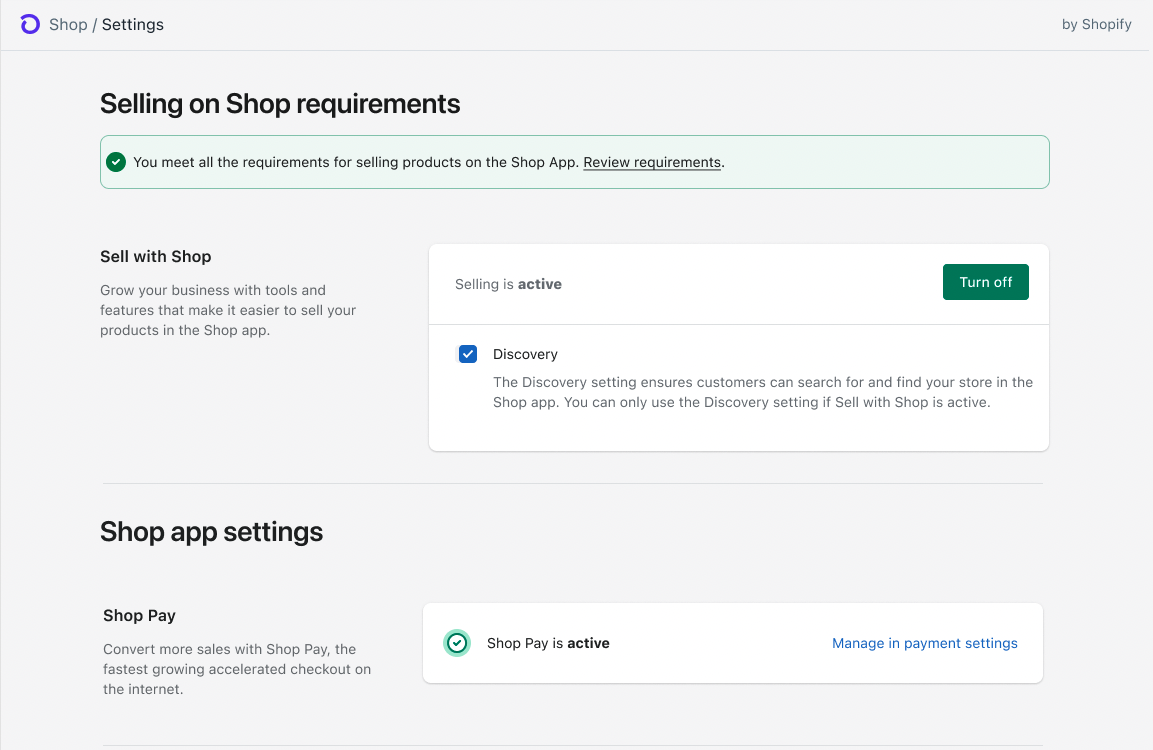
The “happy path” banner: simple, straightforward, and short.
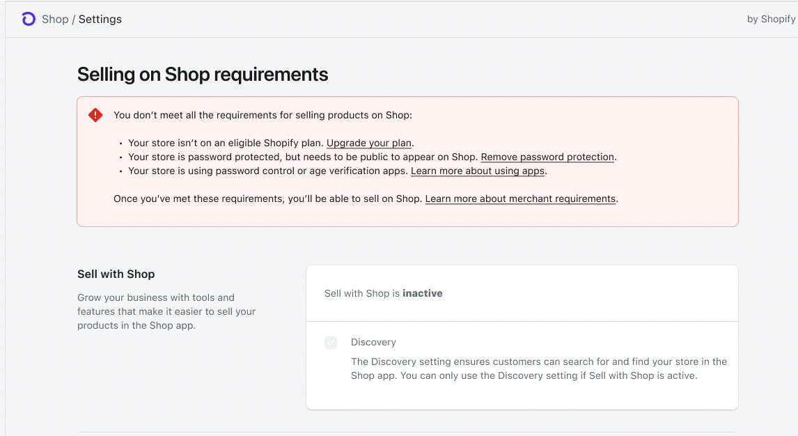
The “not-so-happy path” banner: straightforward, helpful, and actionable.
I devised a few more solutions to improve the overall experience:
I eliminated the checklist completely and moved the “Shopping” section to the top of the settings page. I renamed it “Sell with Shop” to reflect the actual actions our merchants take on the app.
I designed inclusive alternatives to ableist language. (“Disable” and “Enable” became “Turn on” and “Turn off.”)
I experimented with bringing “Selling on Shop requirements” to the top of the page, as well. Ultimately, I didn’t pursue this direction as the language felt clunky and weird.
I validated my ideas during a critique with a few designers in my product area and then socialized my new proposal with the product manager. I got his buy-in to ship this solution, and I worked with my product designer to get the designs poised for build.
The outcome + impact
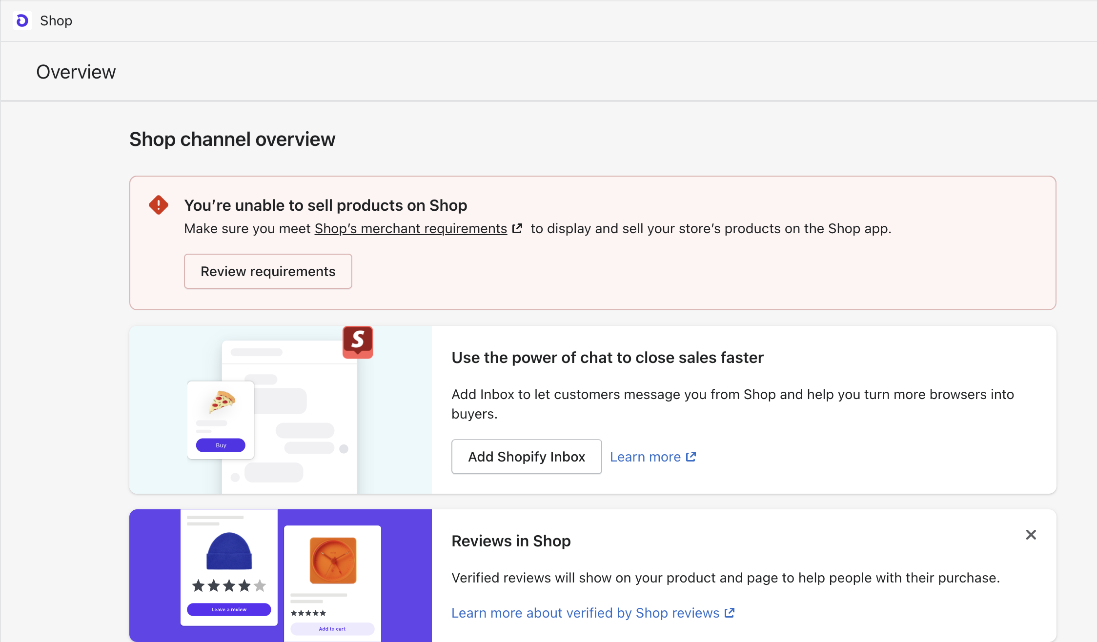
We shipped the new UX with the banner treatment and almost instantly saw wins. Weekly support tickets tagged “merchant eligibility” dropped from 282 at the beginning of the month to 100 just two weeks later. I made a few content tweaks and iterations in the weeks following, expanding the scope of the banner treatment beyond the settings page and to other areas of the Shop channel. It’s now one of the primary ways we surface important information requiring immediate action to merchants in the channel.
I’ve done content design work for several other banners that now appear in the Shop channel. This one comes from my test store, Blerd Base. I’m not doing a great job. 😅