Increasing chatbot response rate with better UX writing
I designed content and conversation for an ineffective chatbot that hurt conversions. Once the team shipped the new flow I created, customer-driven leads increased, generating more business for our partners .
The backstory
Trane Technologies, a major HVAC supplier, hired Red Ventures to help improve its digital marketing prowess. In 2021, that partnership evolved into a joint venture called Magenta Technologies, or M-Tech. I was hired by RV to work on M-Tech’s product line in tandem with our partners at Trane to build a better UX across the company’s four primary web experiences. We considered Trane our external partners, which is how I’ll refer to them in this case study.
The problem
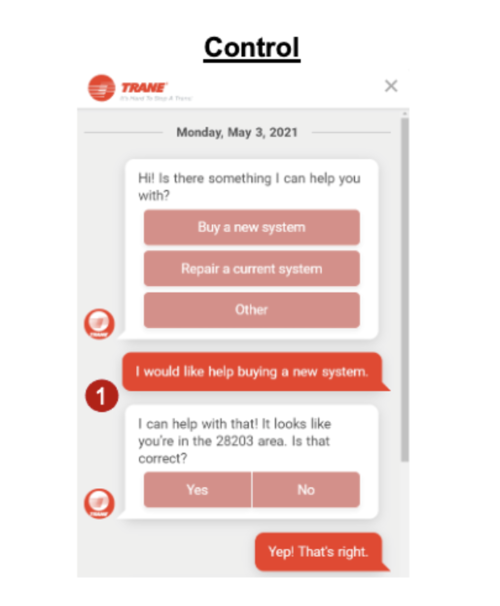
Our partner’s chatbot was failing. It was overtly transactional, forcing customers to commit to speaking with an HVAC dealer and make a purchasing decision way too early in their journey. Users at the top of the funnel were bombarded with CTAs and forms beckoning them to interact with a dealer. And the tone of the chat feature did not reflect the brand’s own shift in priorities to strike a careful balance between educational/nurturing content and transactional content that hooked people farther down the funnel. Plus, the chat failed to account for a number of potential inputs from users who might not have found answers to their questions.
As a result, lead quality was subpar. Response rate, which measured how many leads were successfully sent to a dealer, performed poorly, at about 0.10%. And wins, measured as a successful conversion of a lead to a paying customer - so someone who buys a product or requests a dealer for repair service - were tallied at about 17%. These were not ideal numbers, so we needed to find ways to improve them.
The proposal
Product managers decided to reconfigure the chat to include redirects to educational content on the site, hopefully aligning with our new brand proposition while also increasing engagement from users.
We used site traffic and interaction data to identify the pages we’d use for the redirects.
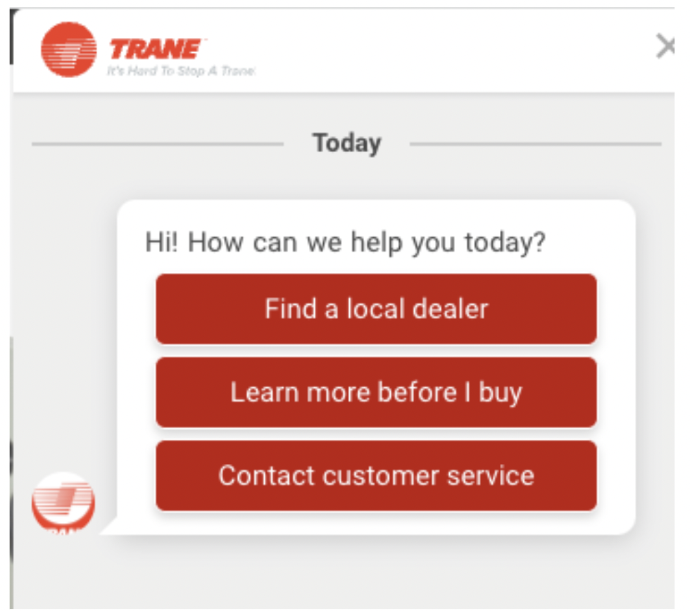
Instead of only sending users to a dealer, we’d provide a customer service option. That seemed like a very logical no-brainer that should’ve been folded into the experience way before we got to it. It wasn’t.
And we’d test against the control.
The process
Because we agreed the chatbot problem was a content problem, I took the lead on designing a new solution. Here are some steps I took to improve the experience:
I eliminated all uses of the first-person “I” and replaced them with “we.” Using “I” felt awkward and even a little frightening considering that the chatbot uses the partner’s logo in the interface, not an actual human face. Because this was unlikely to change, I felt “we” was more appropriate as people are more accustomed to brands referring themselves as “we” in their communications.
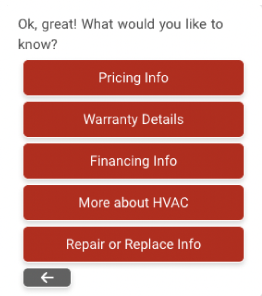
I modified the language across all the buttons. For instance, I rewrote “Research about products” to “Learn more before I buy.” I thought about this in terms of an actual conversation. “Research about products” felt stilted and stiff. It doesn’t make people excited to learn about a brand’s products - a word that, I argue, already feels a bit academic and jargon-like. So, I opted for something that felt a lot less studious and a lot more exploratory. The same rationale inspired me to change nebulous inputs like “Before you buy guide” to “More about HVAC.”
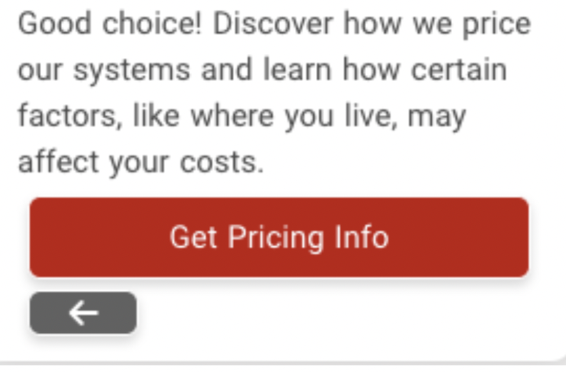
I wrote new copy that added context to people’s options. Let’s say a user decided they wanted “Pricing Info.” They’d engage with the button and receive a response that helps them understand what they’re about to do. So, instead of just getting a CTA to the pricing page, they get: “Good choice! Discover how we price our systems and learn how certain factors, like where you live, may affect your costs.” That leaves little room for misinterpretation and it helps the user validate their own intent. Adding “Good choice!” was a risky move on my part. Those two words took up valuable real estate. But, I strongly felt like we needed to add friendlier language throughout the experience. “Good choice!” is friendly and helps disarm people because it’s a mental affirmation nudge. I wanted users to feel good about the experience they were about to embark on, and I wanted them to feel like we were their champions, available to help and guide.
Most of the experience included “Submit” buttons users would interact with once they entered information. “Submit” feels like you’re at the end of an experience, but that often wasn’t the case in the chat. More questions were coming. I recast each of those buttons as “Next,” saving “Submit” for the final question in the flow.
For one flow, I simultaneously added a new option while eliminating redundancy. In the former experience, users had limited options for how they would interact with customer service. Their only option was to immediately get on the phone. So, I added the “Talk to a rep” option, which feels friendlier and, hopefully, less intimidating. That’s specifically for people who want to talk to someone over the phone. As for people who want to use the contact form, they now have that option. Now, stakeholders proposed adding yet another “screen” for users after they chose the contact form. This felt unnecessary, so I asked engineering if we could simply direct users to the on-site contact form without giving them forcing them to press another button. The answer was yes. It was an easy ask with an easy solution that helped reduce friction for users.
While we didn’t want to only send users to dealers, we still needed to present dealers as an option, and we needed to be more inclusive. The partner does business in Canada, yet so much of the content in the chatbot focused on a U.S. audience. To course correct, I added “Postal code” to any instance where we mentioned ZIP code.
Once I finished with the content updates, I helped map out a new flow in the CMS we used to manage the chatbot.
The outcome
We shipped this new iteration and almost immediately tracked significant results.
Our response rate went up 104%. More leads reached more dealers.
Our wins went up 18%. More users took more actions and engaged with more dealers.
And another metric we didn’t expect: Our follow-ups went up 82%. This is a dealer-reported metric in which they indicate the disposition of interaction with a potential customer. That they catalogued more follow-ups is an encouraging sign for more conversions.